It starts with a battery
A sustainable future depends on homes that can not only produce but store their own energy. By storing solar, homes can power themselves through the night, eliminate gas appliances and even feed back to the grid at times of peak demand.
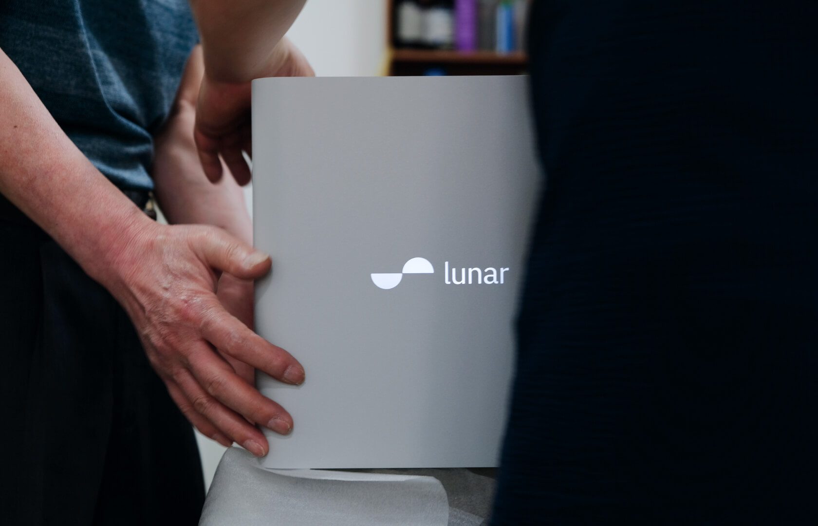
Lunar Energy was founded in 2020 to help move the world towards all-electric homes.
Daylight has been Lunar’s design partner from the beginning.
A sustainable future depends on homes that can not only produce but store their own energy. By storing solar, homes can power themselves through the night, eliminate gas appliances and even feed back to the grid at times of peak demand.
Lunar Energy was founded in 2020 to help move the world towards all-electric homes.
Daylight has been Lunar’s design partner from the beginning. In 2023, our work together received iF awards for both Product and UX categories.


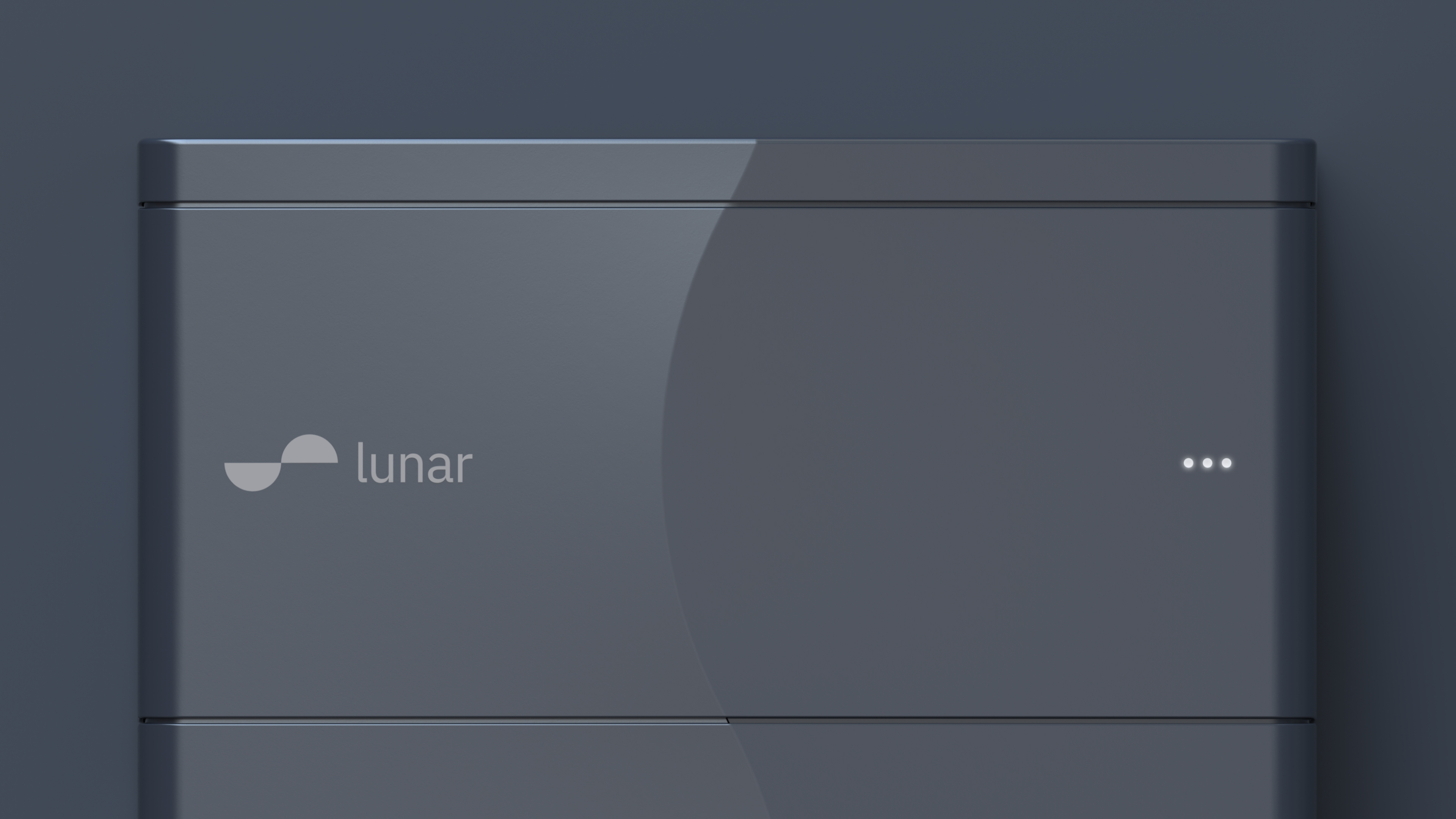
Capture the day. Power the night.
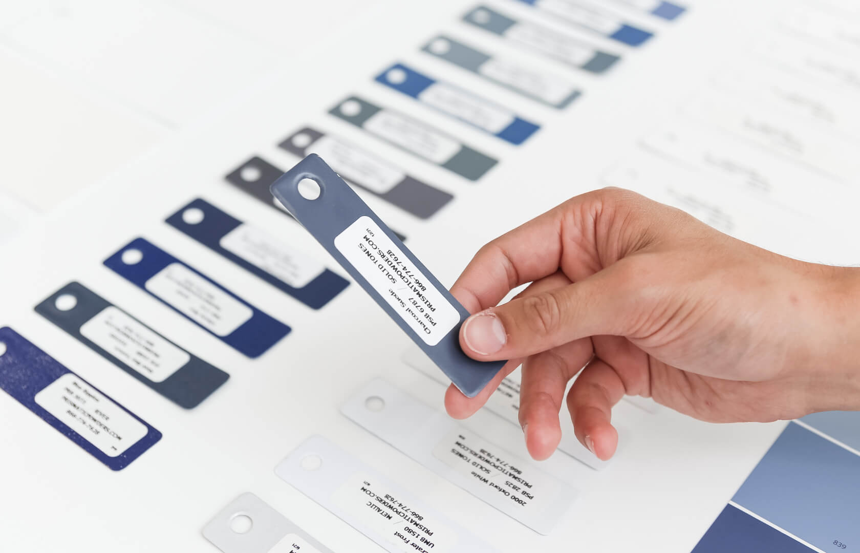
Inspired by the cyclical nature of the sun and moon rising and falling, the Lunar Arc captures the spirit of the company in its mission to create a truly sustainable future. Simple and poetic, the logo holds tension through the constant flow of energy with fluidity, balance, and precision.
Our branding process ran in parallel to our ID development, which enabled a tightly woven, holistic, and compelling design story. By working with the founders through brand exercises, we identified Lunar’s brand principles and key characteristics: Optimistic, Clear, and Brilliant.
This design story comes to life with the arc flowing through the industrial design, playing with light and shadow while the app lets users interact by scrolling through their day.
Prior to our rebrand work, the San Francisco Health Network's messaging placed emphasis on the providers and the system. The Network described itself as the City’s “only complete system of care.” The Network logo was an icon of the Golden Gate Bridge.
Through our work, we wanted to shift focus from describing the system to communicating the value added for the patient. We sought to:
- Publicly reaffirm San Francisco’s commitment to accessible health care for all of its residents, regardless of immigration status or insurance;
- Create a unifying brand that resonated deeply with patients and staff; and
- Give staff desperately needed tools to clearly and consistently describe the Network, its values, and its services.


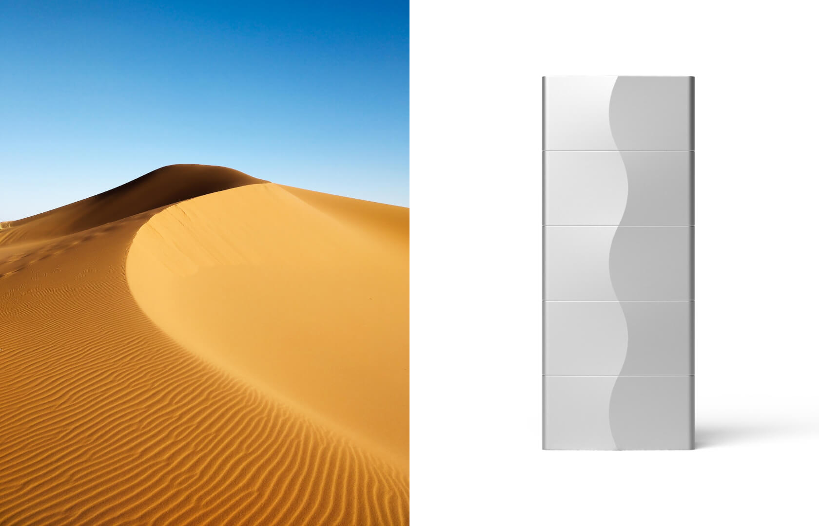
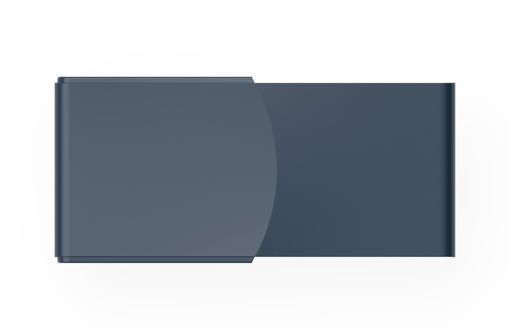
Light and shadow
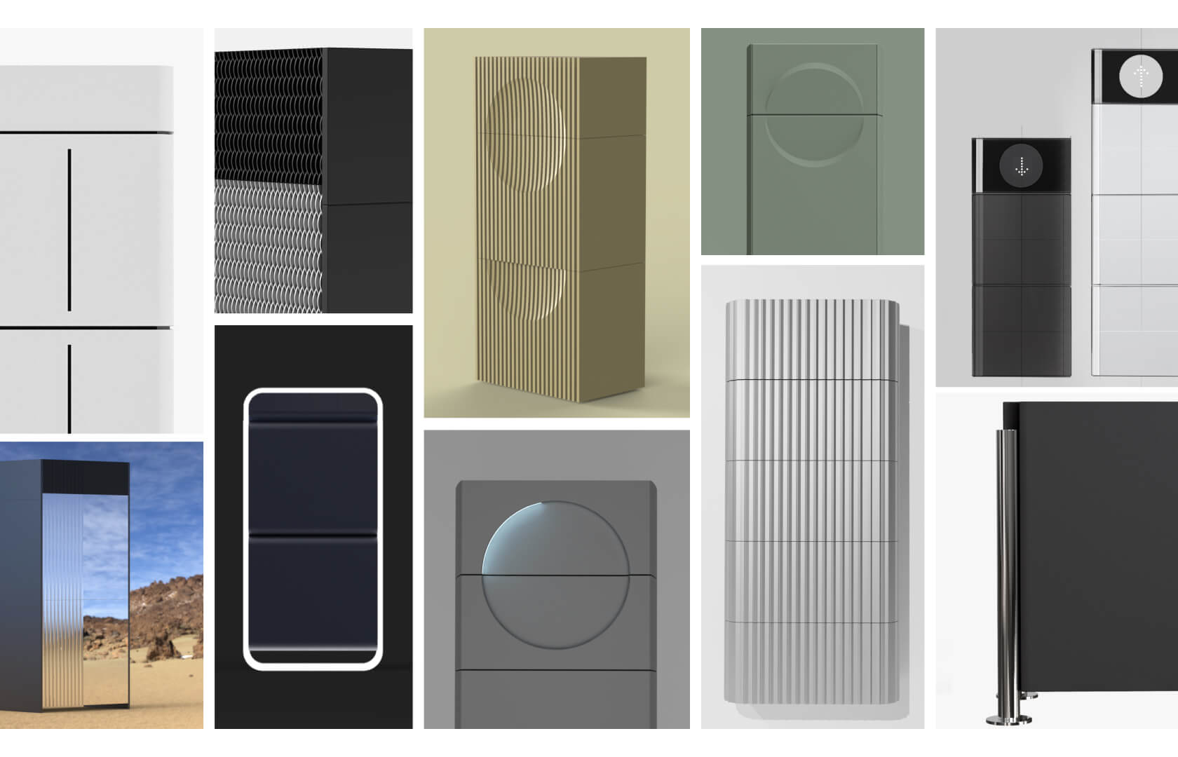
The Lunar Arc, derived from the Logo, flows up the battery stack, uniting its modules into a complete form. Inspired by the crest of a sand dune, the curve protrudes from the front face of the battery units and produces a dynamic lighting effect that shifts as the sun moves through the sky.
The design focused not just on the end user, but also on the installer. The modular nature of the battery, combined with a wall mounting bracket system and reversible enclosure panels allows a single installer to assemble the entire stack, significantly reducing installation costs.
Prior to our rebrand work, the San Francisco Health Network's messaging placed emphasis on the providers and the system. The Network described itself as the City’s “only complete system of care.” The Network logo was an icon of the Golden Gate Bridge.
Through our work, we wanted to shift focus from describing the system to communicating the value added for the patient. We sought to:
- Publicly reaffirm San Francisco’s commitment to accessible health care for all of its residents, regardless of immigration status or insurance;
- Create a unifying brand that resonated deeply with patients and staff; and
- Give staff desperately needed tools to clearly and consistently describe the Network, its values, and its services.


Electricity in human speak
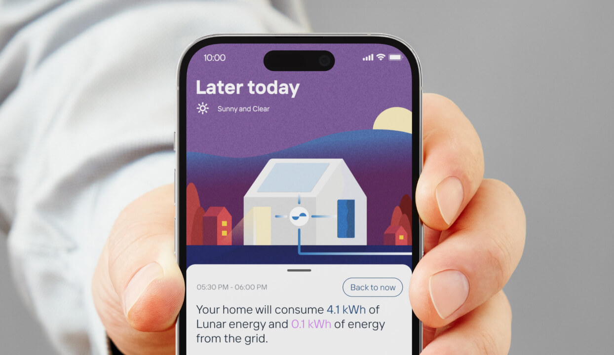
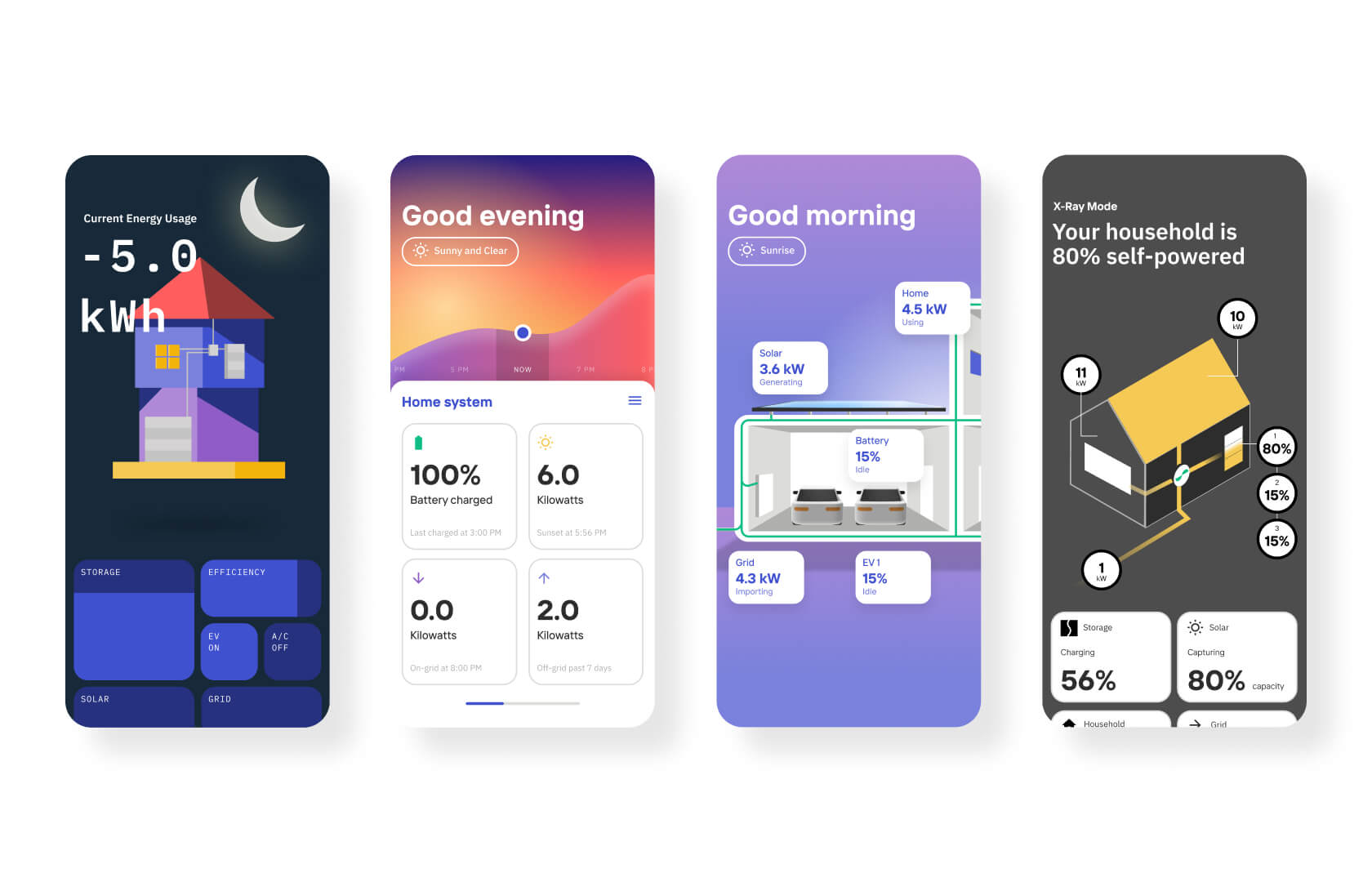
Based on research and insights from both users and internal stakeholders with a spark of imagination, we designed a deeply technical yet intuitively playful energy management app that gives users total control of their Lunar System.
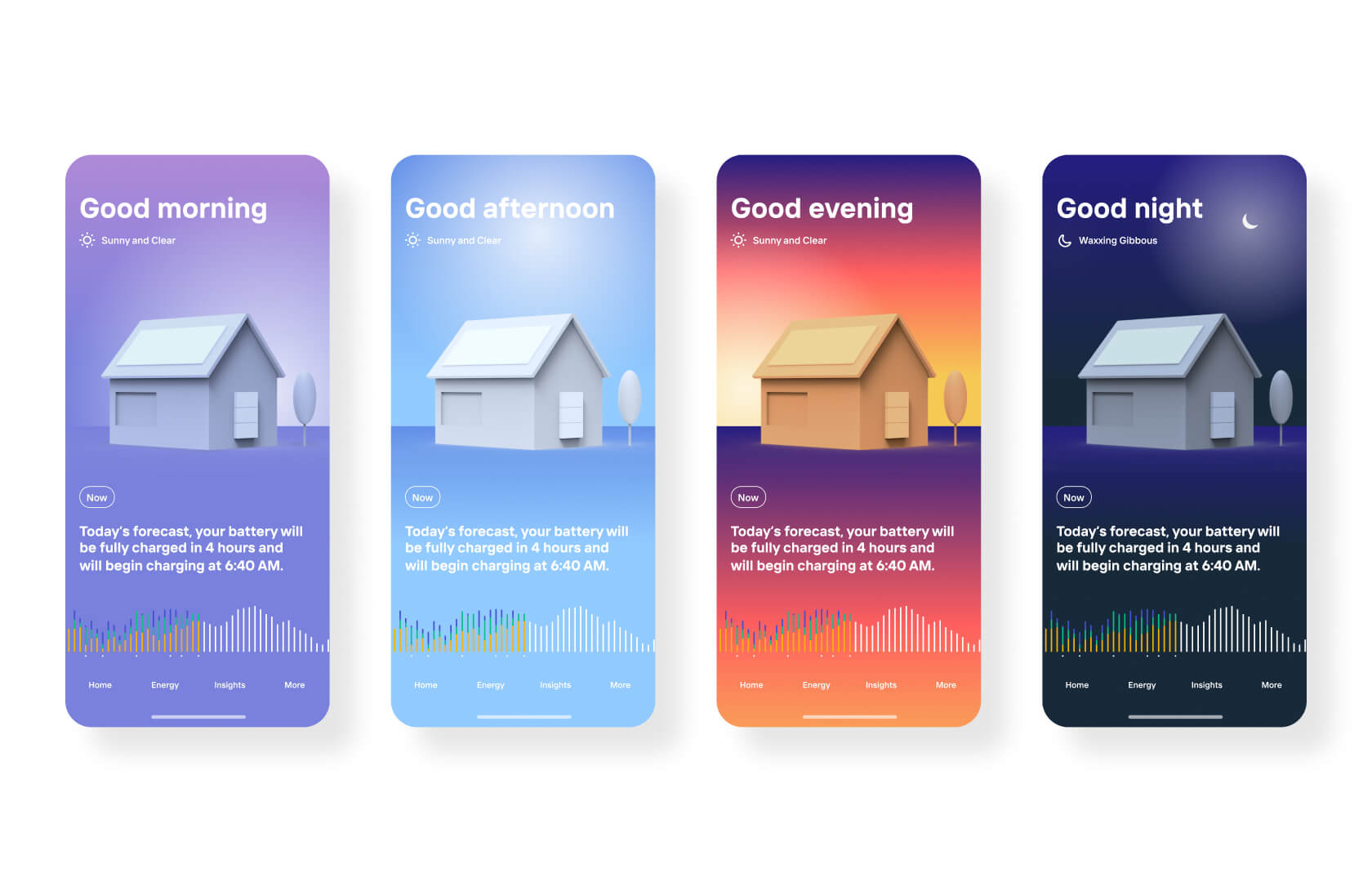
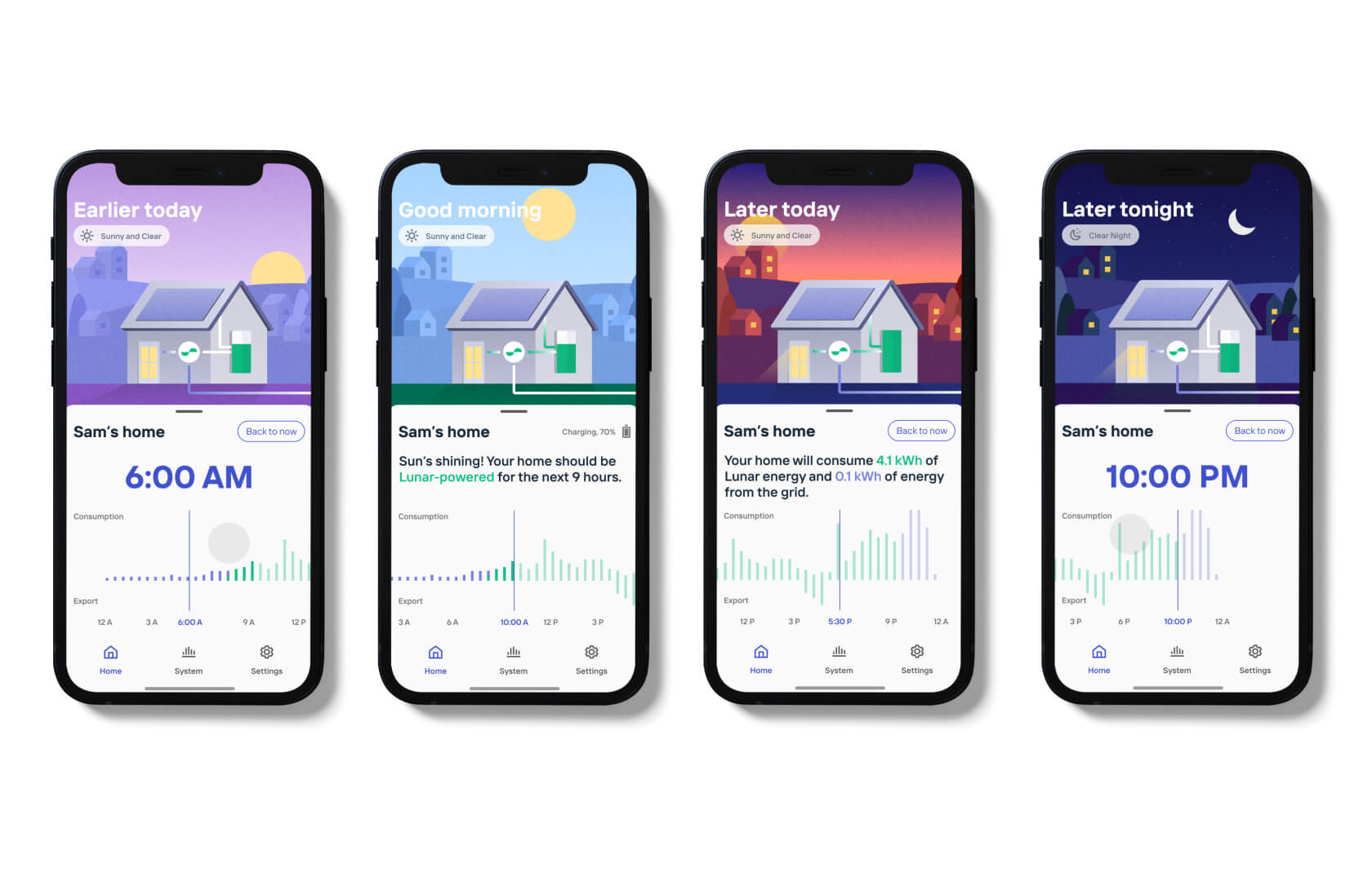
The concept of energy units and its usage was abstract and difficult for most to grasp. Users' experiences with their home energy typically involved looking at graphs and charts in relation to cost. We wanted to give users a sense of their home energy system at a glance through an iconic expression of a home in context. As the day unfolds, the app adapts to the time of day and weather conditions, representing real-time environmental changes that directly impact their energy system. Advanced AI predicts and communicates performance in human language so users know what to expect.
A simplified bar graph tracks and predicts energy usage, allowing users to scroll back and forward throughout their day. Scrubbing the energy graph back and forth gives users a delightful and playful visualization of how the environment influences their energy production and usage.
The Systems tab provides highlights of each component that makes up the Lunar System. For power users, diving into each component reveals granular details and insights, including power load management for complete home energy controls.
Prior to our rebrand work, the San Francisco Health Network's messaging placed emphasis on the providers and the system. The Network described itself as the City’s “only complete system of care.” The Network logo was an icon of the Golden Gate Bridge.
Through our work, we wanted to shift focus from describing the system to communicating the value added for the patient. We sought to:
- Publicly reaffirm San Francisco’s commitment to accessible health care for all of its residents, regardless of immigration status or insurance;
- Create a unifying brand that resonated deeply with patients and staff; and
- Give staff desperately needed tools to clearly and consistently describe the Network, its values, and its services.
- Give staff desperately needed tools to clearly and consistently describe the Network, its values, and its services.
- Give staff desperately needed tools to clearly and consistently describe the Network, its values, and its services.
- Give staff desperately needed tools to clearly and consistently describe the Network, its values, and its services.
- Give staff desperately needed tools to clearly and consistently describe the Network, its values, and its services.
- Give staff desperately needed tools to clearly and consistently describe the Network, its values, and its services.
- Give staff desperately needed tools to clearly and consistently describe the Network, its values, and its services.
- Give staff desperately needed tools to clearly and consistently describe the Network, its values, and its services.
-


Reflections from the CEO
“Our partnership with Daylight was driven by a shared belief in the power of design to deliver simple and elegant solutions that put the user at the center. Daylight’s scope was large, helping establish our brand identity, the industrial design of our first product, the Lunar System, and the user experience of our two apps. They took us through a thoughtful process to come up with our company's name and logo. We are really proud of where we landed. What I really valued about Daylight was that they acted as if they were an internal team to Lunar. They were not afraid to directly engage me and challenge decisions. They advocated for the highest design standards while also contemplating engineering and production constraints. Overall, we had a great working relationship with Daylight. They are a team that is customer-centric, open-minded, friendly and inherently creative."
- Kunal Girotra, Founder & CEO of Lunar Energy
Related projects


