Cookie Preferences


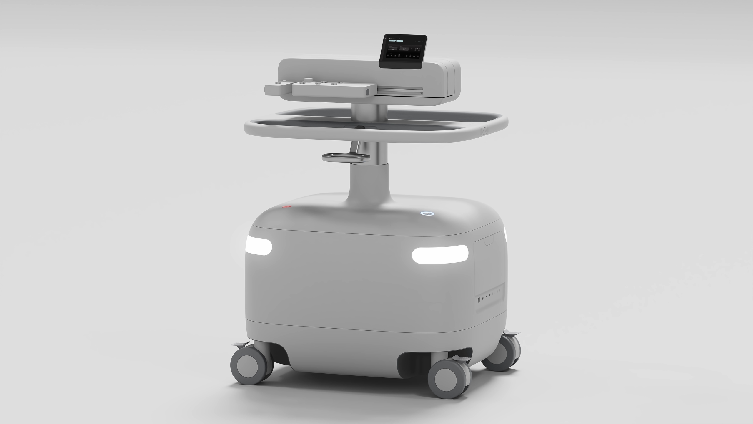
A sustainable future depends on homes that can not only produce but store their own energy. By storing solar, homes can power themselves through the night, eliminate gas appliances and even feed back to the grid at times of peak demand.
Lunar Energy was founded in 2020 to help move the world towards all-electric homes.
Daylight has been Lunar’s design partner from the beginning.
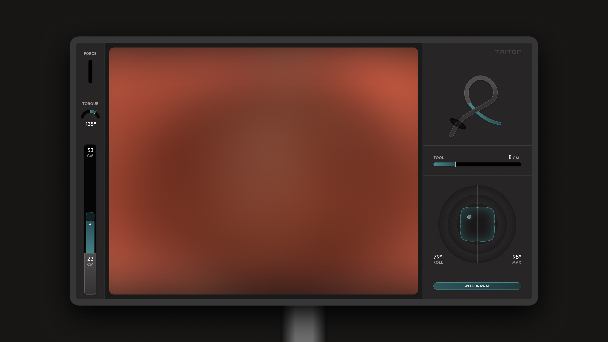
Med-tech startup Neptune Medical approached Daylight with the brief to design a holistic visual experience and design system for their Triton endoscopic medical robot. Created for increased comfort for both patient and physician, the robot aims to transform a field which has been ruled by medical procedures that have not fundamentally changed since their first conceptualization more than 50 years ago.
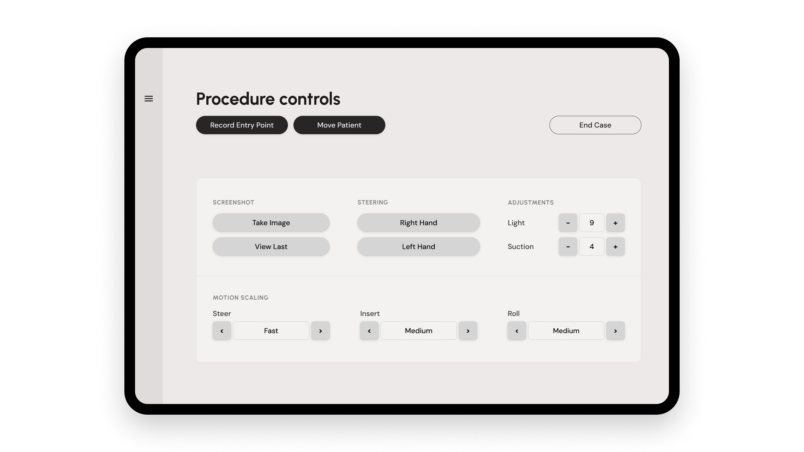
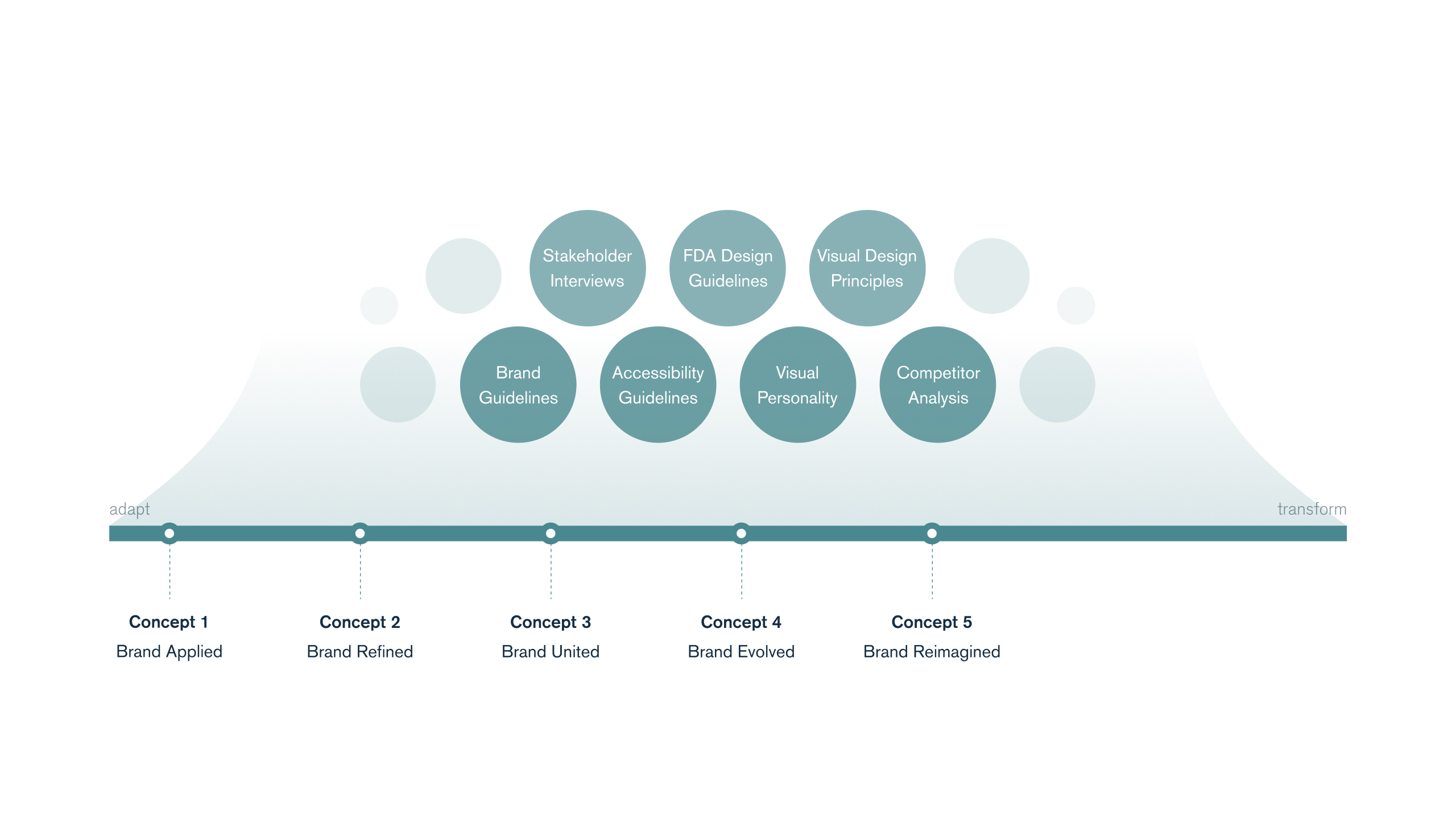
Several design concepts were tested, both in bright and dark surgery room environments to ensure the best usability for all medical practitioners. All designs follow strict medical and accessibility guidelines, creating a visual experience that meets regulatory norms without ever neglecting to incorporate Triton’s brand identity.
Prior to our rebrand work, the San Francisco Health Network's messaging placed emphasis on the providers and the system. The Network described itself as the City’s “only complete system of care.” The Network logo was an icon of the Golden Gate Bridge.
Through our work, we wanted to shift focus from describing the system to communicating the value added for the patient. We sought to:
Simple and sleek, the design aims to reduce cognitive and visual load to a point where it is intuitively usable without requiring constant focus on what is happening on screen. Subdued color palettes that use highlights only in specific moments allow for a design that can take the backset when attention shifts while still being able to alert doctors and physicians of critical situations when necessary.
Prior to our rebrand work, the San Francisco Health Network's messaging placed emphasis on the providers and the system. The Network described itself as the City’s “only complete system of care.” The Network logo was an icon of the Golden Gate Bridge.
Through our work, we wanted to shift focus from describing the system to communicating the value added for the patient. We sought to:
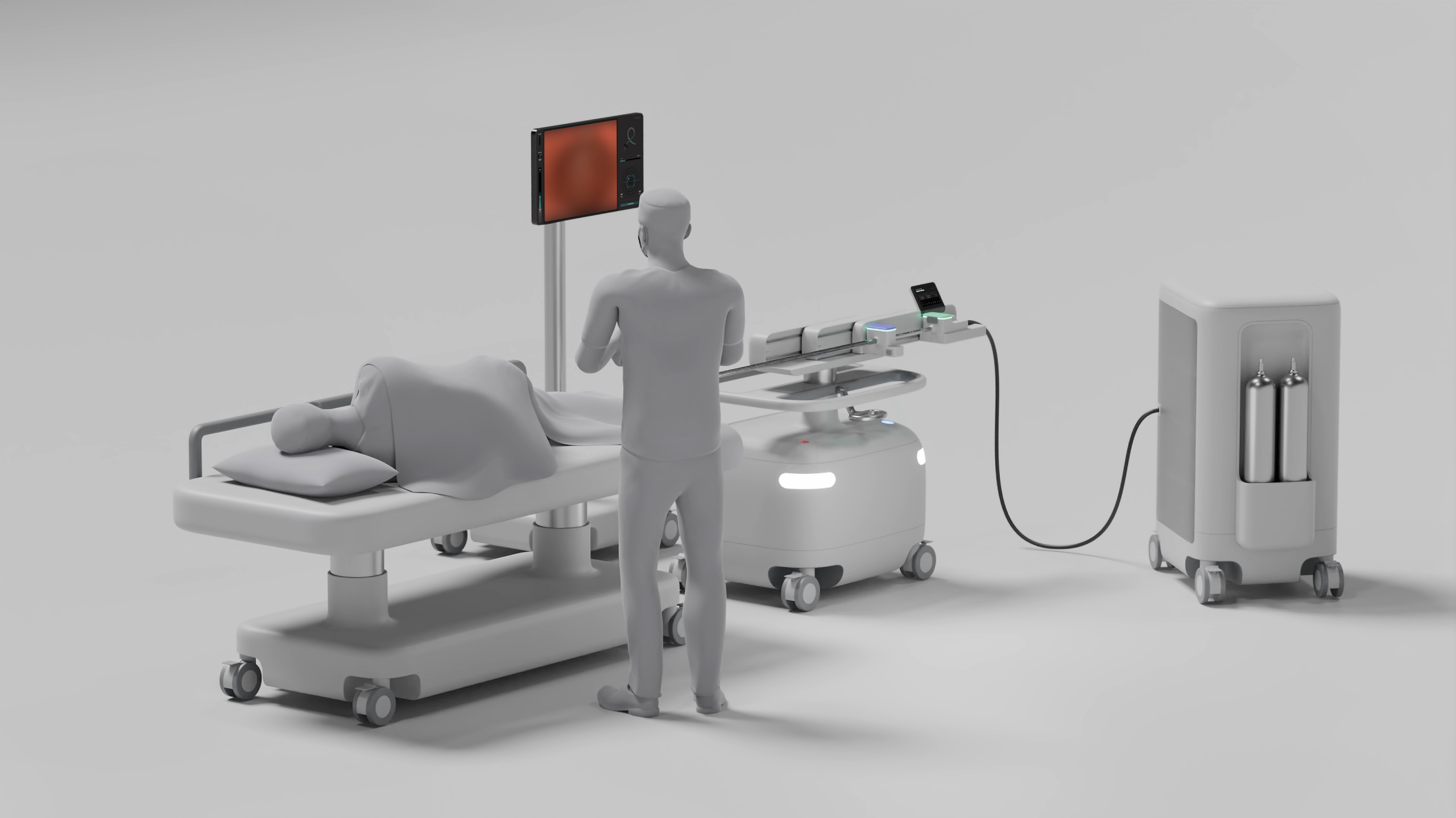
Simple and sleek, the design aims to reduce cognitive and visual load to a point where it is intuitively usable without requiring constant focus on what is happening on screen. Subdued color palettes that use highlights only in specific moments allow for a design that can take the backset when attention shifts while still being able to alert doctors and physicians of critical situations when necessary.
Prior to our rebrand work, the San Francisco Health Network's messaging placed emphasis on the providers and the system. The Network described itself as the City’s “only complete system of care.” The Network logo was an icon of the Golden Gate Bridge.
Through our work, we wanted to shift focus from describing the system to communicating the value added for the patient. We sought to: