
Cookie Preferences

A sustainable future depends on homes that can not only produce but store their own energy. By storing solar, homes can power themselves through the night, eliminate gas appliances and even feed back to the grid at times of peak demand.
Lunar Energy was founded in 2020 to help move the world towards all-electric homes.
Daylight has been Lunar’s design partner from the beginning.
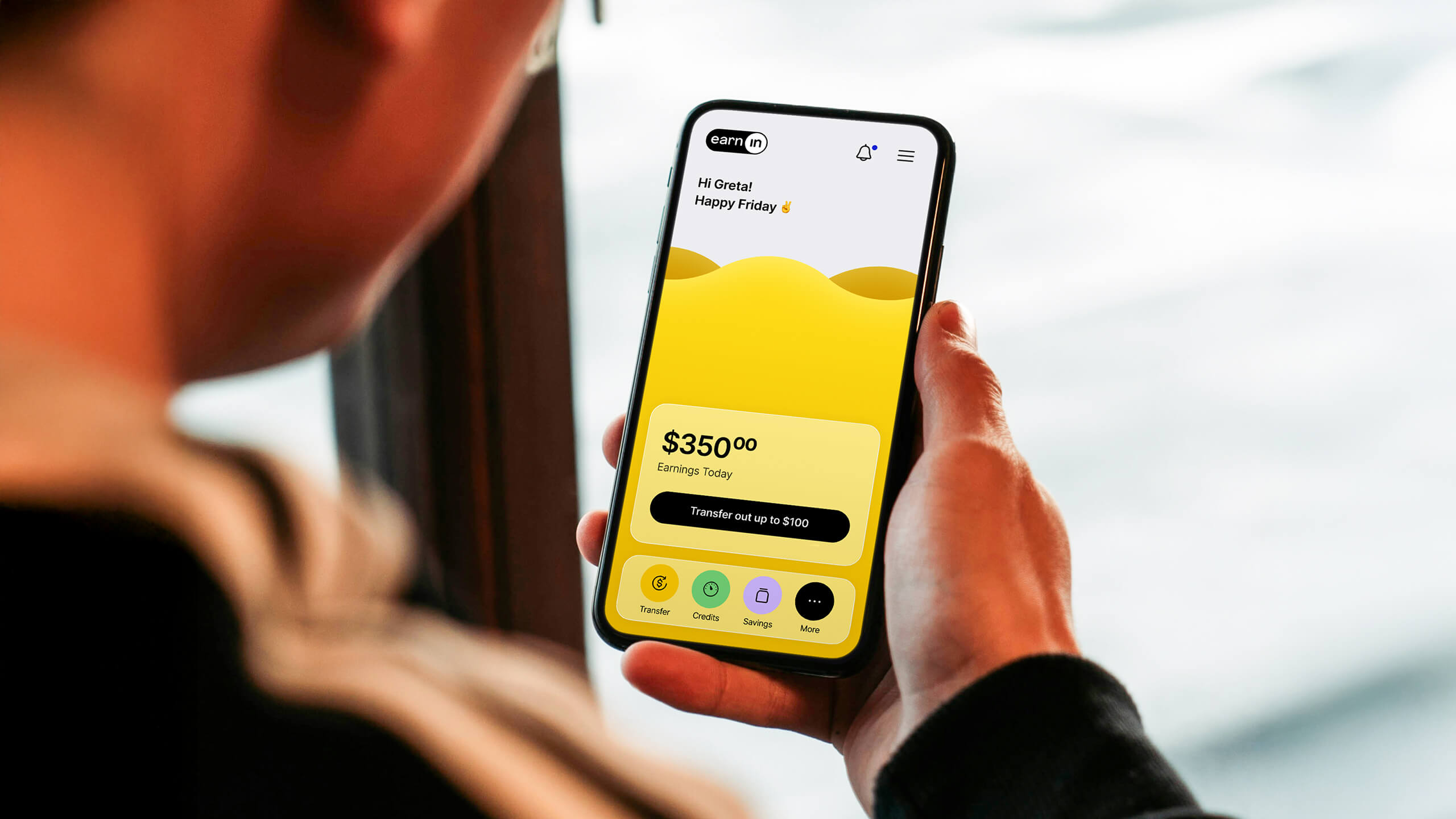
EarnIn is a consumer fintech company that enables people to access their earned wages on demand as they work—with no fees or interest. While they had strong early adoption, they knew that in order to evolve from a single-purpose early wage–access tool into a daily money companion for users, they needed better design. Daylight helped them develop a suite of engaging micro-interactions and thoughtfully integrated new features that strengthened emotional connection, elevated usability, and drove long-term retention.
One of the areas the team decided to tackle was revamping the app’s primary navigation and home screen experience to better support users in finding relevant features. Our team experimented with a variety of novel UX approaches that incorporated various micro-interactions to connect users to the features best suited to their needs. The launched navigation has notably improved feature discovery.
Prior to our rebrand work, the San Francisco Health Network's messaging placed emphasis on the providers and the system. The Network described itself as the City’s “only complete system of care.” The Network logo was an icon of the Golden Gate Bridge.
Through our work, we wanted to shift focus from describing the system to communicating the value added for the patient. We sought to:
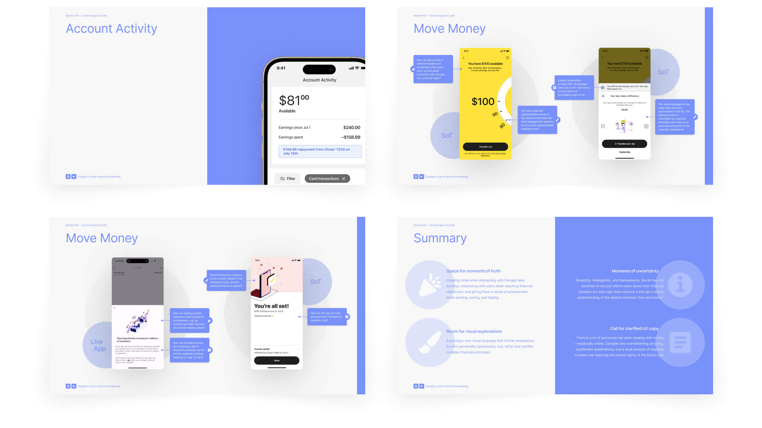
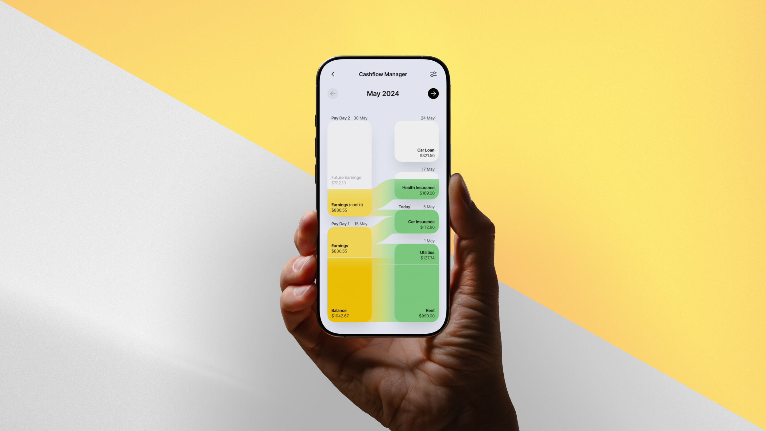
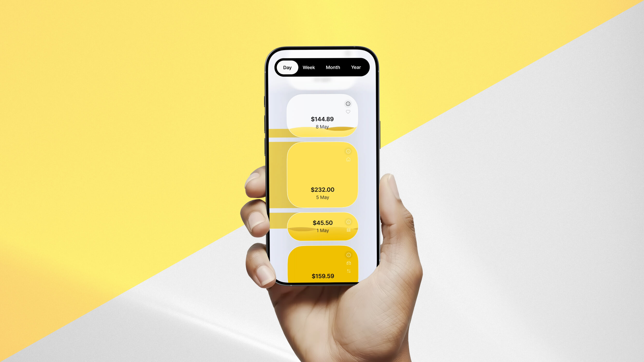
In later sprints, Daylight thought through how we could show money flows in interesting ways that customers would find both engaging and genuinely useful in managing their finances. Our goal was to help people stop thinking of money as a static element, but rather a fluid resource that moves in and out in connection with time. To explore the different visualization directions, we created animated motion studies and interactive Figma prototypes, which were rapidly tested with target users to gather feedback and refine designs in real time. These design approaches drove customer delight and met their needs—which led greater retention.
Prior to our rebrand work, the San Francisco Health Network's messaging placed emphasis on the providers and the system. The Network described itself as the City’s “only complete system of care.” The Network logo was an icon of the Golden Gate Bridge.
Through our work, we wanted to shift focus from describing the system to communicating the value added for the patient. We sought to:
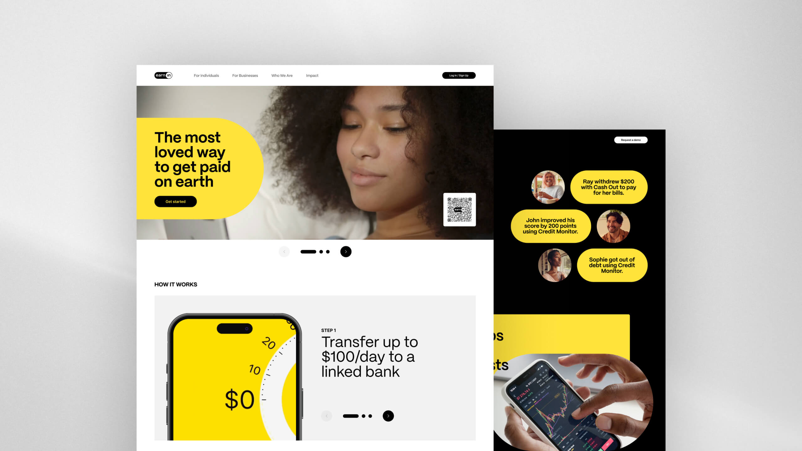
With the app work garnering positive user feedback and improved metrics, EarnIn decide to engage Daylight for an additional sprint to revamp the experience of their website. With a mixture of streamlined UX/UI choices and whimsical creative touches, EarnIn’s website is now creatively aligned with the improved app experience we established previously.
Across the app and website, by delivering a comprehensive range of design solutions from early-stage concept sketches to build-ready screens across the sprints, we equipped the EarnIn team with more than just actionable deliverables. Our work provided a strategic, forward-looking vision for their evolution, laying out a clear and inspiring roadmap for elevating their comprehensive user experience—not only in the immediate term, but well into the future.
Prior to our rebrand work, the San Francisco Health Network's messaging placed emphasis on the providers and the system. The Network described itself as the City’s “only complete system of care.” The Network logo was an icon of the Golden Gate Bridge.
Through our work, we wanted to shift focus from describing the system to communicating the value added for the patient. We sought to:
The EarnIn team was inspired to see how Daylight’s process of rapid prototyping helped them define their feature roadmap more efficiently. They developed a deep appreciation for how powerful micro-interactions can bring measurable improvements in KPIs—such as retention rate, session duration and depth, CLTV, NPS, and churn rate—while also uplifting the overall feel of a product. EarnIn has already launched several of Daylight’s designs as part of their app and website, with more in the pipeline. Following this successful collaboration, EarnIn and Daylight have already started working on follow-on projects to develop new innovative features that will spark further user engagement.